No Clocks

No Clocks is a rakish headline howitzer. Don’t forget to read the files inside the zip for details.

Free Fonts
No Clocks is a rakish headline howitzer. Don’t forget to read the files inside the zip for details.

Triac 71 is a funk related funk font with funky proportions, funky design and funkular execution. Don’t forget to read the files inside the zip for details.

Model Worker was created by scratching paint off a school locker with a key. Don’t forget to read the files inside the zip for details.

Screengem is squircular unicase headline artillery. Don’t forget to read the files inside the zip for details.

Mold Papa is a crusty, broken font with emotional issues. Don’t forget to read the files inside the zip for details.

Night Court is a flamboyant, dauntless yell-font. Don’t forget to read the files inside the zip for details.

Dignity of Labour is an over-the-top parody of computer oriented fonts of the late 1960’s.
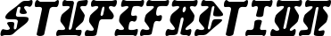
Stupefaction is an outlandish freak font from Terra incognita. Don’t forget to read the files inside the zip for details.

Glazkrak is a brittle, pulverized display sans. Don’t forget to read the files inside the zip for details.

Capacitor is a wide, segmented LCD/LED display font. It’s a wider matrix that a typical segmented font is best used used at smaller sized to to create textural headlines which contrast against something narrow...